You’ve successfully directed traffic to your landing page, and now's the time to capture their information with a form and complete the lead generation loop. Setting up a form for a visitor to fill out doesn’t sound like a troubling task, however simply approaching form creation without doing the research beforehand could turn away potential leads that you could be converting into customers. We’ve highlighted a few steps that can help you optimise your forms for lead generation.
Size is dependent on the offer
Size matters! In order to optimise your form size you need to consider whether filling out your form is worth the reward. You wouldn’t want to give away a huge resource pack and only ask for a name and e-mail a ddress, you’ll be selling your offer short! Similarly, don’t ask a user to fill out a 10 field form to access a 500 word blog post - the form will deter users and those who do fill it out might be left feeling a little disappointed!
Longer forms can help create more qualified leads
Before we talk about the benefits of a longer form, it’s important to note that the length of the form will be determined by your business needs. While quality of a lead is always better than quantity for most businesses, the few will prioritise quantity. In this case, a long form may not be the best option. A short form will no doubt increase conversion and so for these few businesses, perhaps even the shorter the form, the better!
Longer forms will give you more information on a user and so they can help you determine which leads have the most sales potential. However, we know that longer forms risk putting off a potential lead from filling it out. You’ll likely want to hold off on creating longer forms until further down the buyer’s journey, that way a lead will have already interacted with your business and established a level of trust with you. They will require careful nurturing in order to get to that point. Allow them to release a steady stream of information about themselves by extending the length of your forms the further along the journey your customers go. This is where smart forms come in!
Support returning leads with Smart Forms
If you use Hubspot’s software, you can add some much-needed convenience to your landing pages with Smart Forms. Hubspot software will track the journey of your website visitors, contacts and leads. It will know whether a website visitor is new, returning, what offers have previously been downloaded by them and much more. It also remembers the information individuals leads have already entered into a form previously, such as their name, occupation and email addresses. By using Smart Forms, you can justify long forms by conveniently pre populating some fields, making a form much quicker to complete and stopping the user from feeling like they are giving away too much.
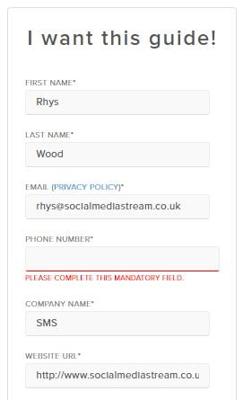
The form below is a Hubspot download. With Social Media Stream being a certified Hubspot partner and user of the Hubsot platform, I spent a lot of time on Hubspots website! It recognises me as a user even without being logged in, the smart form on the landing page has pre populated with my information! All that's left for me to do when I arrive on this page is to fill in my phone number!

Perform an A/B test
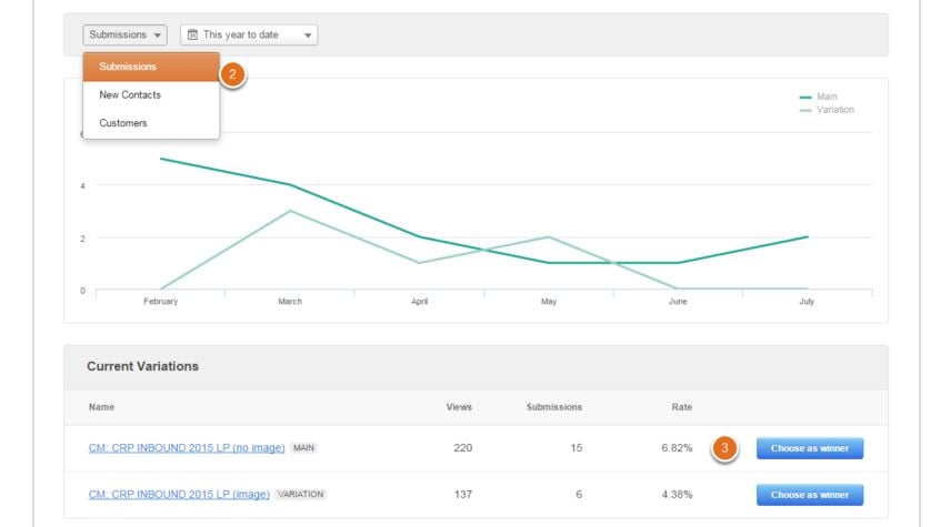
With an A/B test, you can experiment with two different versions of the same landing page to see which results in a higher conversion rate. This is an opportune time to test different form lengths, or perhaps forms asking for different information. If one version has an objective majority, then that should be the form you stick with. If you’re worried about asking for more sensitive or personal information, like a mobile number, an A/B test will help you figure out if asking for that information will deter users.

The A/B tests should be continuous as you should always be looking to improve the quality of your forms.
Properly optimise your landing pages
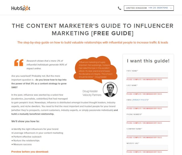
Everything on your landing page should be optimise to encourage the user to convert. We have written a previous blog about how to optimise your landing page for lead generation you can read here, but here are a few steps you can follow to begin to make sure your landing page is fit for duty:
- As a whole, your landing page should be concise and have minimal clutter
- Use a welcoming dialect. Avoid phrases like “submit” and use positive, progressive phrases like “begin your free trial” or “claim your free download.” Nobody wants to feel like they are “submitting” something, or feel like they’re being forced into an offer. Be positive!
- Clearly show the difference between mandatory and optional fields. A common way to highlight required fields is to place an asterisk next to the text. For optional fields, simply type the word “optional” in brackets.
- Show you care about a your leads’ privacy. Include a link to your privacy policy on the form, preferably next to sensitive information such as their email address or phone number.
- Make sure your form stands out and is visible, while ensuring its style is uniform to the rest of the page.
- To further increase chances of conversion, it is best practice to remove the navigation bar of your website. You don’t want to distract the user before they get chance to submit the form.
- Everyone knows that images = engagement, so it’s best to include a relevant image on your landing page. Make sure it isn’t too large as slow loading times can deter the user!

Remember that your form is required to deliver the offer to the visitor. Your landing page might be superbly laid out, its text well thought-out and on-topic. But it will mean nothing if the form turns the user away. Just remember not to bite off more than you can chew. Never ask for information that isn’t required, and match the form to to the value of the offer. Follow the steps we’ve outlined and you’ll be converting leads in no time at all.
Learn more about how to fuel your lead generation with our free eBook download!


